
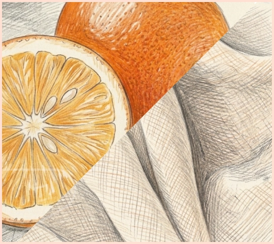
After the vibrancy of summer, September introduces a gentler warmth. The light softens, evenings become cooler and the landscape begins its gradual shift toward autumn tones.
Interiors often follow the same pattern, favouring colours that feel comforting while still retaining brightness. This early-autumn palette pairs the softness of Linen with the energy of Orange, creating a combination inspired by warm afternoons, changing leaves and the optimism of a new season.
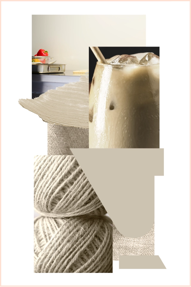
Soft cream tones naturally evoke memories of summer afternoons, relaxed kitchens and comforting interiors. Linen creates a backdrop that feels familiar, welcoming and full of character.
Linen works particularly well in kitchens, dining areas and open-plan living spaces where warmth and light are important. It reflects natural light beautifully, helping interiors feel bright while maintaining a soft, lived-in atmosphere.

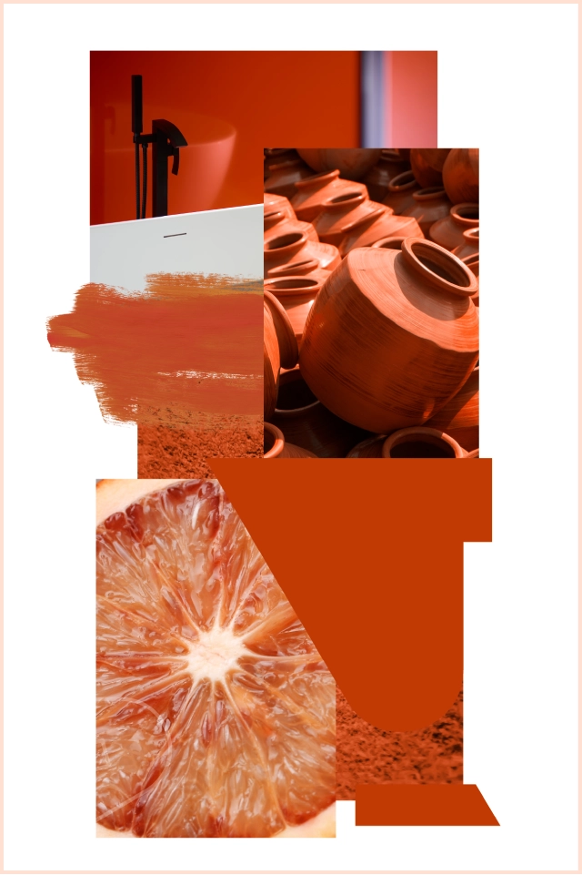
Used independently, Orange creates confident focal points and feature areas. It works especially well for accent walls, design details and spaces where creativity and energy are encouraged.

Used on interior cladding walls, the combination naturally supports zoning and layered design. Linen can create a soft foundation across larger surfaces, while Orange adds depth through accent walls and statement features.
A Palette That Welcomes the Season Ahead
What makes this pairing particularly effective is its ability to bridge the seasons. Linen still carries the brightness of summer, while Orange hints at the richer tones ahead. The result feels fresh yet comforting, perfectly suited to early autumn interiors.
For more ideas on using colour to shape atmosphere and interior design, explore Colour Psychology in Interior Design.
