Previous article, Early Spring Balance, explored how gentle seasonal tones can bring calm and harmony to interior spaces as the year begins to shift. As spring continues to unfold, the colours around us become a little stronger and brighter. Fresh growth appears, the sky clears, and the landscape begins to feel full of possibility.
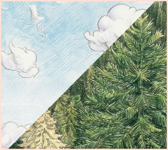
This next early-spring palette captures that uplifting transition perfectly. Pairing the rich depth of Forest with the soft brightness of Sky, it reflects the natural world as it reawakens, deep greens below and clearer blue skies above.
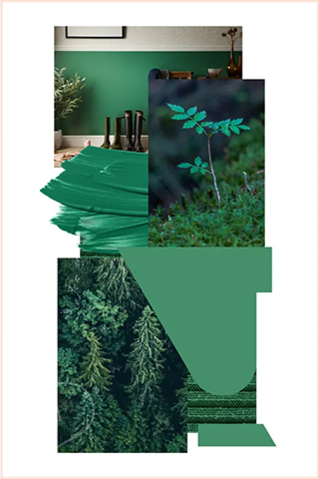
Deep green tones have long been associated with nature, stability, and renewal. Forest is a colour that feels reassuring and timeless, like the steady presence of evergreens through the colder months and the first rich shoots appearing as spring begins. Used on its own, Forest creates a sophisticated and calming foundation. It works beautifully in spaces where you want to bring a sense of depth and quiet confidence. Forest works particularly well in spaces designed for relaxation or connection with nature. Garden rooms, studios, home offices and interior living spaces all benefit from its grounding presence. As the spring light becomes stronger, the depth of green feels even more vibrant, reflecting emerging outdoor greenery.
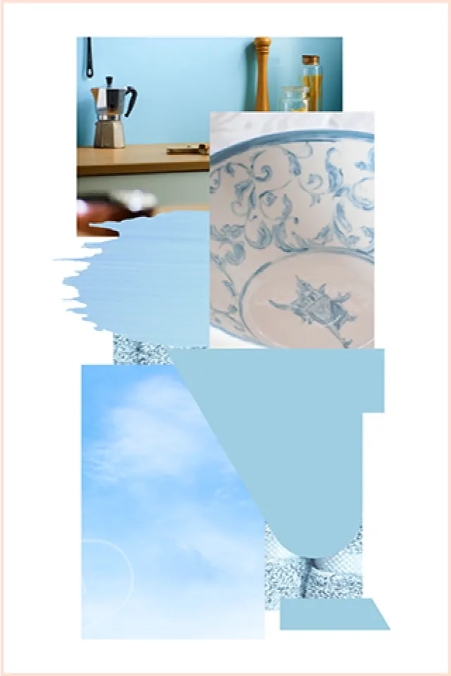
Sky captures its uplifting energy in contrast to Forests grounding side of spring. Soft blue tones mirror the brighter skies that return after winter’s grey days. The colour feels light, fresh and effortlessly optimistic. Used on its own, Sky creates a clean and airy aesthetic that reflects light beautifully, helping rooms feel larger and more inviting. It’s a colour that feels equally at home in modern designs and softer, more relaxed environments.
Together, Forest and Sky create a palette that feels both grounded and uplifting, a balance that mirrors the energy of early spring itself. The deep richness of Forest provides structure and depth, while Sky introduces brightness and movement. The combination naturally reflects the landscape outside: rich green growth beneath expansive blue skies. Used on interior cladding walls, the pairing can also help define different zones within a space while maintaining a calm and cohesive palette. Forest can anchor the room as a primary colour, while Sky introduces contrast and freshness as an accent. Alternatively, Sky can take the lead for a lighter, brighter look, with touches of Forest adding natural depth and visual interest. The result is a combination that feels effortlessly balanced, bold yet calm, fresh yet timeless.
A Palette That Grows with the Season
What makes this pairing particularly appealing is how naturally it transitions through the seasons. In early spring, Forest and Sky reflect the awakening landscape. As the months move toward summer, the colours continue to feel relevant, echoing lush foliage and long bright days. When used for interior spaces, these tones create an environment that feels connected to nature while still maintaining a refined and contemporary aesthetic. It’s a palette that carries a sense of growth and forward movement, perfectly capturing the hopeful shift that spring brings each year. Want to learn more about how colour effects mood, take a look at our article. A Guide to Colour Psychology in Interior Design.