
Colour is one of the most powerful design tools available.
It can make a room feel larger, brighter, warmer, calmer or more energetic. While trends come and go, the colours we choose often reflect our personality, our lifestyle and how we want a space to feel.
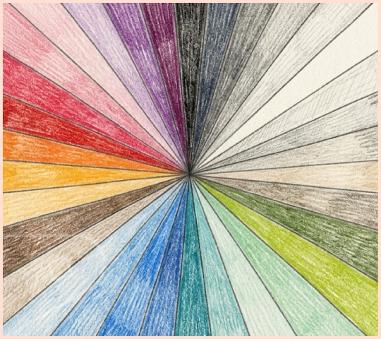
At Direct Cladding, the colour spectrum stretches far beyond simple white panels. From soft neutrals and earthy tones to vibrant blues, greens and statement shades, there's a colour for every vision.
You may have seen our inspirational “Colours of the Month” which we have chosen as reflecting the moods of the changing seasons - but you can choose a Season’s colours and keep them with you all year round, or clad different rooms with the colours of different seasons to suit your mood and the lighting in each.
So, where do you sit on the spectrum?
Starting with the Classics
For many, timeless simplicity is the perfect place to begin.
The Palette: White Gloss, White Satin


White Gloss and White Satin remain enduring favourites, creating bright, clean spaces that feel fresh and spacious. They provide the perfect backdrop for almost any interior style, from contemporary bathrooms to practical utility rooms.
The Palette: Linen, Ivory, Pebble, Sandstone




Alongside white, softer neutrals such as Linen, Ivory, Pebble and Sandstone introduce warmth while maintaining a calm and understated appearance. These shades are ideal for those who prefer interiors that feel welcoming, balanced and effortlessly stylish.
The Rise of Contemporary Greys
Over the past decade, grey has become one of the most influential colours in interior design.
The Palette: Dove, Rhino and Clay



Dove, Rhino and Clay offer varying depths of grey, allowing homeowners to create modern spaces with character and sophistication. For those looking to make a stronger statement, Ash and Slate introduce darker tones that bring drama and contrast without overwhelming a room.
These colours work particularly well in garden offices, commercial spaces and contemporary home interiors.
Inspired by Nature
Green continues to dominate interior design because of its ability to create a connection with the natural world.
The Palette: Kiwi, Willow, Forest and Avocado




At the lighter end of the scale, Kiwi and Willow bring freshness and energy. Olive offers a more muted, earthy character, while Forest and Avocado provide richer tones that create depth and warmth.
Whether used in a home office, summer house or feature wall, green shades can help create spaces that feel calm, restorative and inviting.
Coastal Blues and Calming Tones
Blue is often associated with tranquillity, clarity and open space.
The Palette: Sky, Mint, Duck Egg, Aqua, Atlantic, Lagoon, Marine and Night








Soft shades such as Sky, Mint and Duck Egg create light, airy interiors, while Atlantic and Aqua introduce more vibrant coastal influences. For those seeking a bolder look, Lagoon, Marine and Night offer deeper, more dramatic options that add confidence and sophistication.
Blue remains one of the most versatile colours in modern interior design, equally at home in bathrooms, workspaces and living areas.
Warmth, Energy and Personality
Not every space needs to play it safe.
The Palette: Apricot, Sunflower, Orange, Blossom and Rosewood





Apricot and Sunflower bring warmth and optimism, helping to create uplifting environments full of energy. Orange offers a vibrant contemporary feel, while Blossom and Rosewood introduce softer pink tones that add warmth without overpowering a room.
For those who love colour, these shades offer the opportunity to create spaces that feel distinctive, personal and full of character.
Making a Statement
At the boldest end of the spectrum sit the colours that demand attention.
The Palette: Ruby, Plum and Fuchsia



Ruby, Plum and Fuchsia bring confidence and individuality, transforming ordinary spaces into memorable interiors. Used as feature colours or within creative commercial environments, they prove that wall cladding doesn't have to be purely practical - it can also be expressive.
Find Your Place on the Spectrum
Whether you're naturally drawn to the simplicity of White Satin, the calming influence of Sky and Duck Egg, the organic warmth of Forest and Olive, or the bold confidence of Ruby and Plum, every colour tells a different story.
The beauty of colour is that there are no right or wrong choices. There is simply the colour that feels right for you, your space and the atmosphere you want to create.
With one of the UK's most extensive ranges of coloured solid uPVC cladding, Direct Cladding gives you the freedom to explore the full spectrum and create interiors that are as individual as the people who use them.
So, where do you sit on the colour spectrum?
